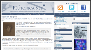
Sexy new dress
By Psyche | November 15, 2010 | Print This Post | E-mail This Post | 6 Comments
 A redesign for ahrfoundation.org was planned for its third birthday, which passed, unobserved, on October 31st. So we can consider this a belated birthday present.
This is the fourth design for the website. The colours and central image have remained largely unchanged,1 but I’ve worked to streamline it’s look, and make it easier to find certain information.
The design actually went into effect on the weekend, as members of our Facebook group were aware. (Thanks for your help and patience, guys!) This past weekend has been spent tweaking and perfecting the design you now see, though if you stopped by to read the latest Saturday Signal or the post about Spare, you may have seen it in its early stages.
(BTW, if you’re viewing this post in a feed reader, you may want to head over to the website to take a look. The image above can’t really do it justice.)
So, what’s changed?
Header
The header now contains an image link back to the home page, as well as links to our RSS feed, Twitter account and Facebook group, along with stats indicating how many subscribers, followers or fans are in each.2
The blog’s four main topics, Occulture, Philosophy, Spirituality and Magick are still present, on the same bar as the top four pages, About, Press, Submissions and Contact. The remaining pages have been moved to the footer, freeing up the top of the page.
Sidebars
The sidebars light up when you hover over a selection, which I think looks kinda cool.3
In addition to listing the topics, categories, and recent posts, the most popular posts are now on display as well.
Author links now point to a dedicated page for that author, listing information about them, their website(s), and their most recent contributions to the blog.
Top commentators also appear with their Gravatars and a link back to their website, if available. For your image to appear in either the sidebar or the comments, simply register your e-mail address with Gravatar and select the image you’d like to appear. You can even set up multiple addresses, if you separate your occultural and public selves. Gravatars work across a large network of blogs and websites and, once registered, your image will appear on all comments and posts you’ve made in the past. Cool stuff.
Main Content
I’ve reduced this from the latest five entries to the latest three, reducing scroll, and hopefully making for an easier reading experience.
Now you can easily print and/or e-mail posts by clicking on the appropriate link(s) just below the title of the posts.
Author boxes now appear at the bottom of individual posts with the author’s Gravatar, bio and website.
Footer
The latest posts in the Essays & Opinion, News & Shiny, Reviews, and Saturday Signal categories have been moved to the bottom of the page along with brief excerpts of their content.
As noted above, the remaining pages are viewable from links at the bottom of the screen, which frees up the top of the page.
I think that pretty much covers it.
Your thoughts?
Our last update was in June, when we added a few minor features, and back then I asked for your thoughts on the new stuff. I’m going to to the same now.
So, what do you think? Do you like the new design? Dislike it? Or has apathy set in after such a long post?4
Footnotes:
- Though the background tiling has been removed and replaced with a dark grey, speeding up loading time. [back]
- For the curious, the Twitter and Facebook stats are real time, but the RSS stats come from Feedburner, which is usually at least a day behind, and notorious for being a little shifty. Though they’ve improved quite a bit recently. [back]
- I’m a nerd, praising my own design, I know. [back]
- If so, I forgive you. [back]


Sexy. I particularly love the blatantly obvious feed icon in the top right. I’m sick of hunting websites for pinky-nail-sized RSS/Atom links tossed in with other “crap I can’t find a place for” in the footer/sidebar/Narnia.
Thanks! I was worried it might look to ostentatious – it’s good to hear it’s working for you. :)
i like the new design. the post is easy on the eyes & the sidebars more closely resemble an index. (especially important as the mark of a good blog is the same as for a good book: a clear & concise index)
Oh good, thanks!
Looks great – nice work. :)
Thanks!
The blog loads faster now, too. I’m so excited.
(< -- Nerrrrd.)